|
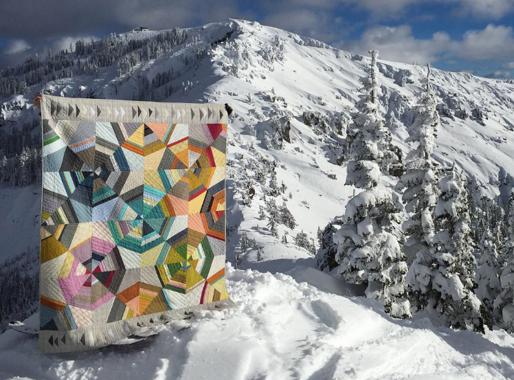
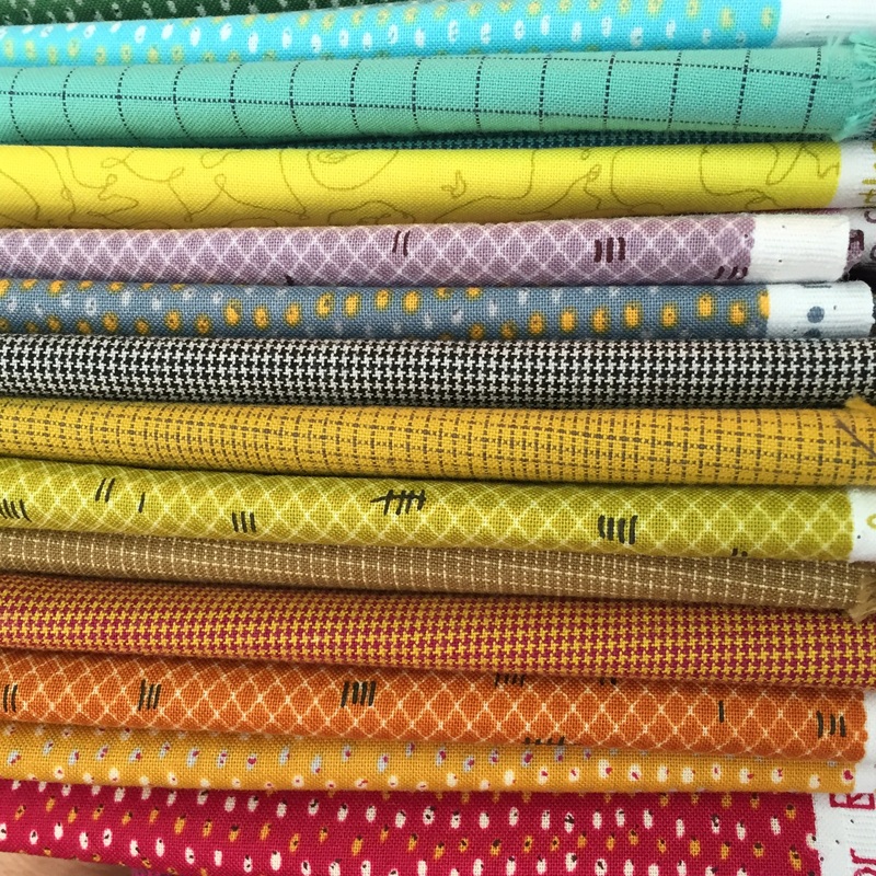
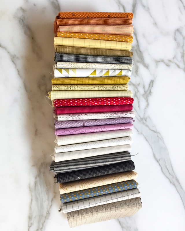
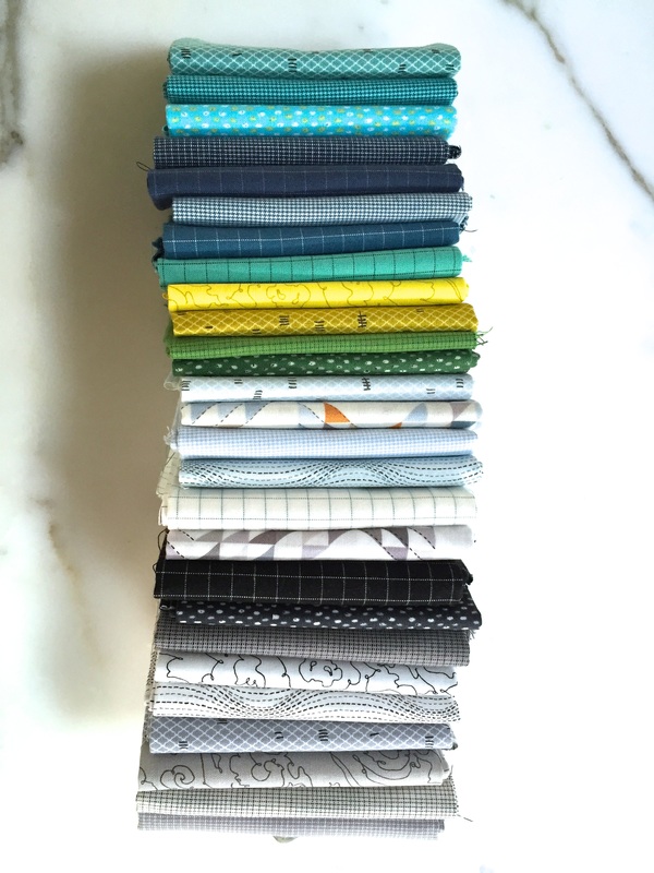
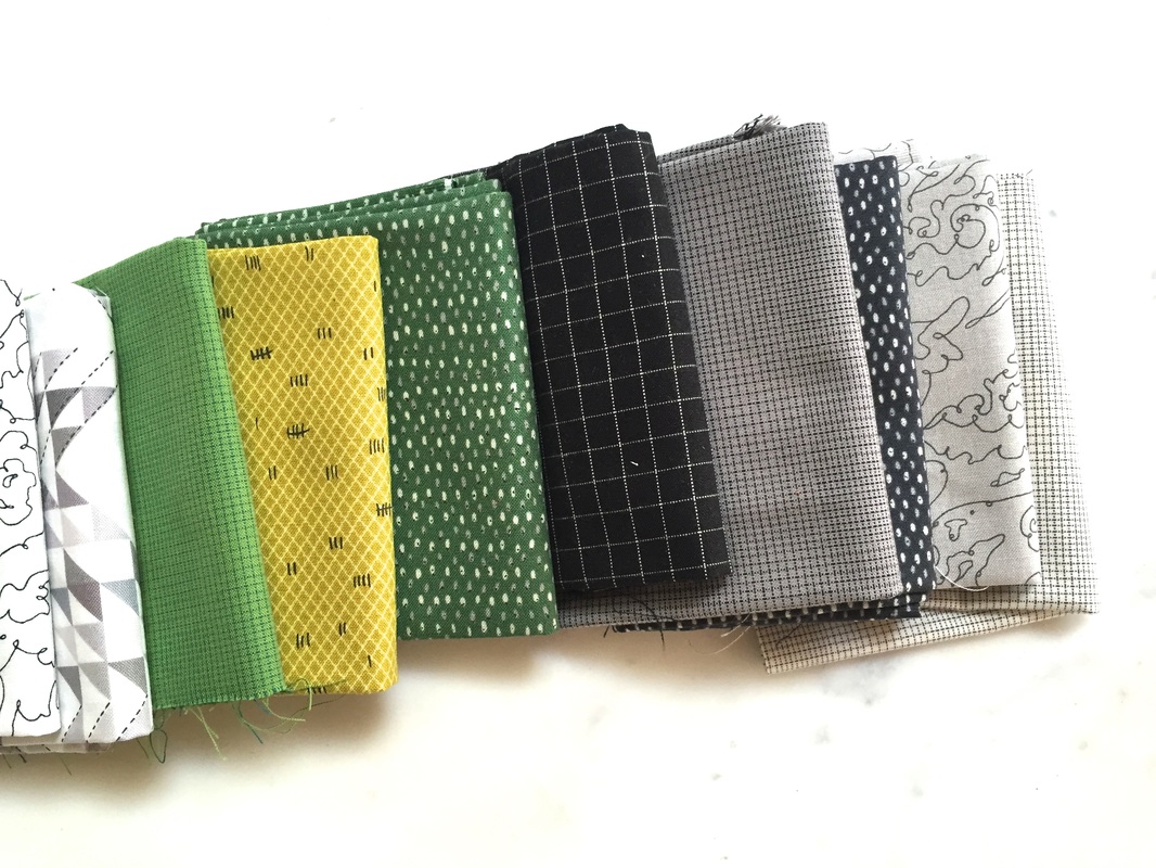
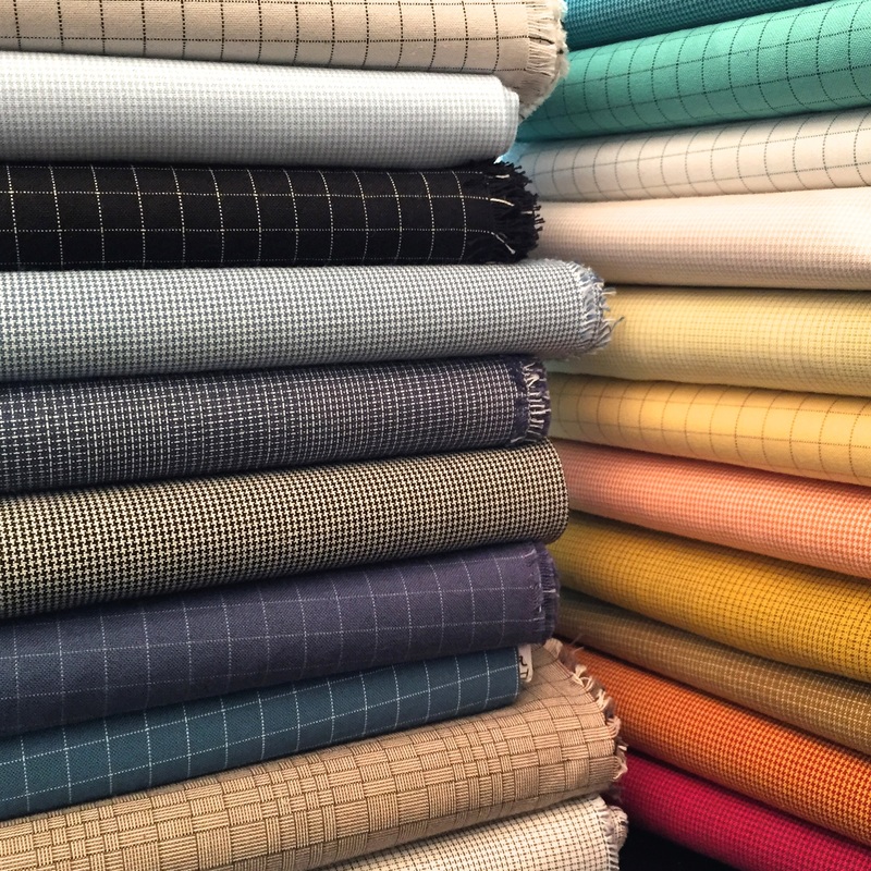
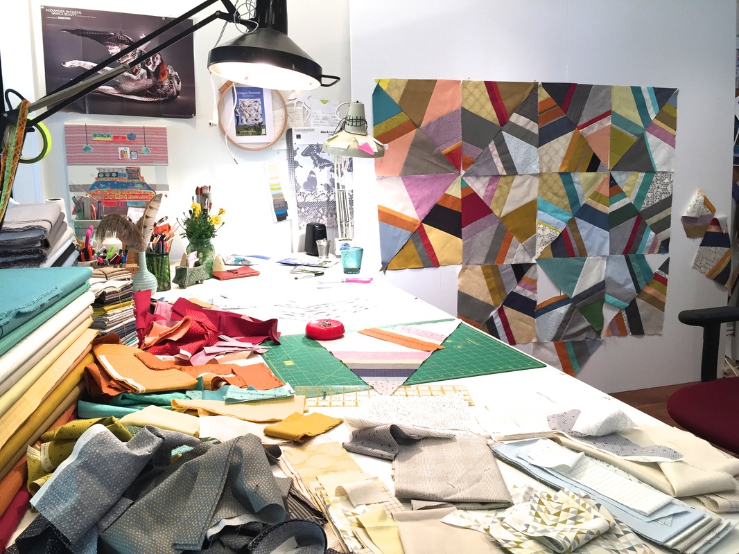
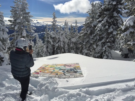
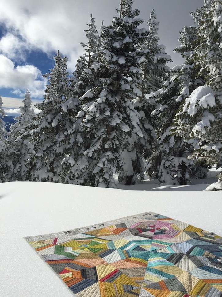
Hello to all my Quilt Loving People! This is my second OCTAGON SHIMMER QUILT (pattern with Stash Books) I've made and this one is done up in my latest collection, STUDIO STASH 3 PRINTS AND WOVENS (Robert Kaufman). A lot more colorful than the first Octagon Shimmer which will be hanging at Quilt Con for any of you lucky ones going to Pasadena next month. It also had different challenges because my new collection, Shimmer 2, has so much color. I will be addressing color choices and balance in my upcoming workshop at the Cotton Patch. When dealing with lots of color, it's important to study both hue and value and the relationship they have to each other in the various combinations you can arrange them in. It's important to give breathing room. It's important to group like colors together so transitions are pleasing. It's important to understand value and how it keeps something from being too bland or flat looking. Value can offer drama without hitting you over the head with it. In any great painting, the artist has mastered the understanding and use of value. Also it is important to put the boring, dirty and weak hued colors in a quilt. They allow the rich, brights to shine even more. I am teaching this three day workshop, OCTAGON SHIMMER at the Cotton Patch in Lafayette, California the weekend of Friday February 5-7 where we will learn this pattern and how to choose color successfully. The Cotton Patch just got the new fabric in complete with bolts and precuts! I am also giving a presentation next week, the evening of Thursday, January 28th titled, PRINT MEETS WOVEN: A LOVE STORY to talk about the ins and outs of mixing prints and yarn dyes/wovens with lots of samples on hand. I would love to see you if you are at all local. Above is the warm color story to the left and cool story to the right. They are great on their own but blended together create a very festive palette! I used the entire collection for the Octagon Shimmer Quilt above using just FQ towers. I cannot stress enough the importance of all the "colors" you didn't notice at first glance. Look again and just study the quiet ones. Play with the screen by holding up your hand/fingers to cover the brights and see how different it looks without them. Then look again at the top quilt and see how important the non bright are. Further look at the landscape in the background void of most color except sky blue. Yet the drama of white to black is stunning. See what I mean? Showing a little detail of prints. Peeking on the left is my "Matisse" doodle, HST print, true grass green yarn dye, ticking time print, etc....All are based on little wonderings that I have. I absolutely love the yarn dyes. They are the best quality on the market. So nice to work with and wash beautifully without losing any shape. Detail of almost all the yarn dyes in the group. They stand alone too! But I like them best mixed with the prints. Studio mess is always necessary when creating. Fun, dynamic, scary at times, exhilarating and very, very rewarding! Combining my love of color, fabric, quilts and nature. And a few behind the scenes shots below. Yep, that is my supportive husband and one of my sons at the top of Sugar Bowl Mountain recently. Blue bird day, no? Teaching is something I really enjoy and have more time for now that the kids are getting bigger. I really enjoy working with other inspired makers who take the time to create something beautiful for themselves or as a gift. Let me know if you would like me to come to your area or guild/shop. I would enjoy that.
Have a wonderful weekend and I hope you make the time to sew a little and get outdoors. xo
7 Comments
|
Jennifer SampouStories from the Studio My PatternsSubscribe to my YouTube ChannelCategories
All
Past Entries
April 2024
|
- Home
- Store
- Learning
- Going Green
-
Fabric Library
- SKY
- Chalk & Charcoal Basics
- Chalk & Charcoal
- Spring Shimmer
- Winter Shimmer
- Winter Shimmer 2
- Shimmer On
- black&white 2
- Studio Stash 3 Cool Story prints and yarn dyes
- Studio Stash 3 Warm Story prints and yarn dyes
- Shimmer 2014
- Shimmer II - 2015
- black&white 2015
- Studio Stash II - 2014
- color:FULL 2014
- Studio Stash Yarn Dyes 2014
- Daisy Love Flannel Collection 2014
- Studio Stash Fabric Collection 2013
- Continuum Fabric Collection 2012
- Fiesta Collection 2011
- About
- My Blog
- Newsletter Sign Up
|
Have a Question? Email us at [email protected]
Links I Love©1990-2024 Jennifer Sampou. All Rights Reserved.
|
|





 RSS Feed